Minimalist Web Design

What is Minimalist Web Design
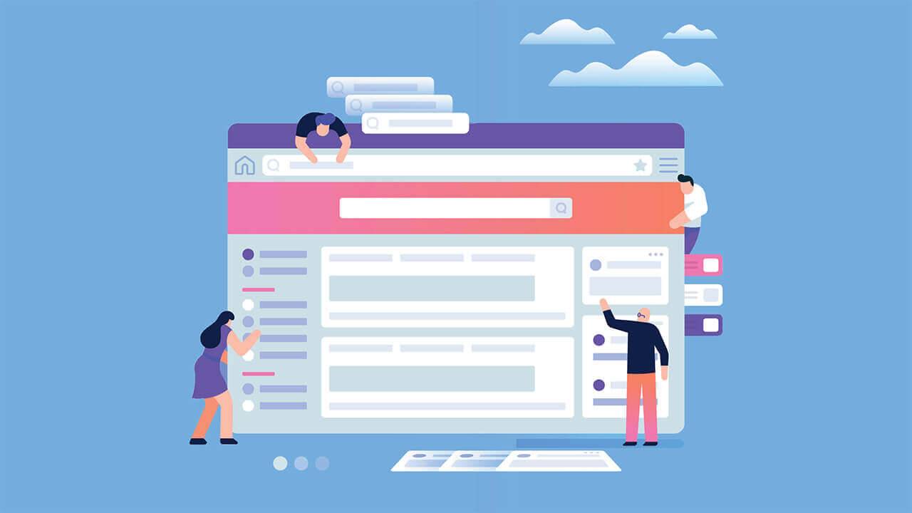
Minimalism is taking over the internet. Countless websites, big and small, now use a minimalist web design. It revolves around the concept of less is more. Websites with a minimalist design feature fewer colors, links, font types, textures, buttons, template images, menus and other visual design elements than their counterparts.
Benefits of Minimalist Web Design
If you’re thinking about using a minimalist web design, though, you might be wondering what benefits it offers. Switching to a new web design requires work, and a minimalist web design is no exception. Nonetheless, embracing minimalism can improve your website’s level of success in several meaningful ways.
Fewer Errors
A minimalist web design will protect your website from errors. Errors are typically attributed to bad code. If a visual element isn’t coded correctly, it may trigger an error message when requested by visitors. Links, for example, can trigger a 404 error if they point to an invalid URL. Images may fail to render if they have an invalid path.
With a minimalist web design, your website will have fewer visual elements and, therefore, fewer opportunities for errors to occur. Visitors will be able to navigate your website without constantly experiencing errors. In turn, you’ll foster a more loyal and satisfied audience of visitors.

Faster Load Times
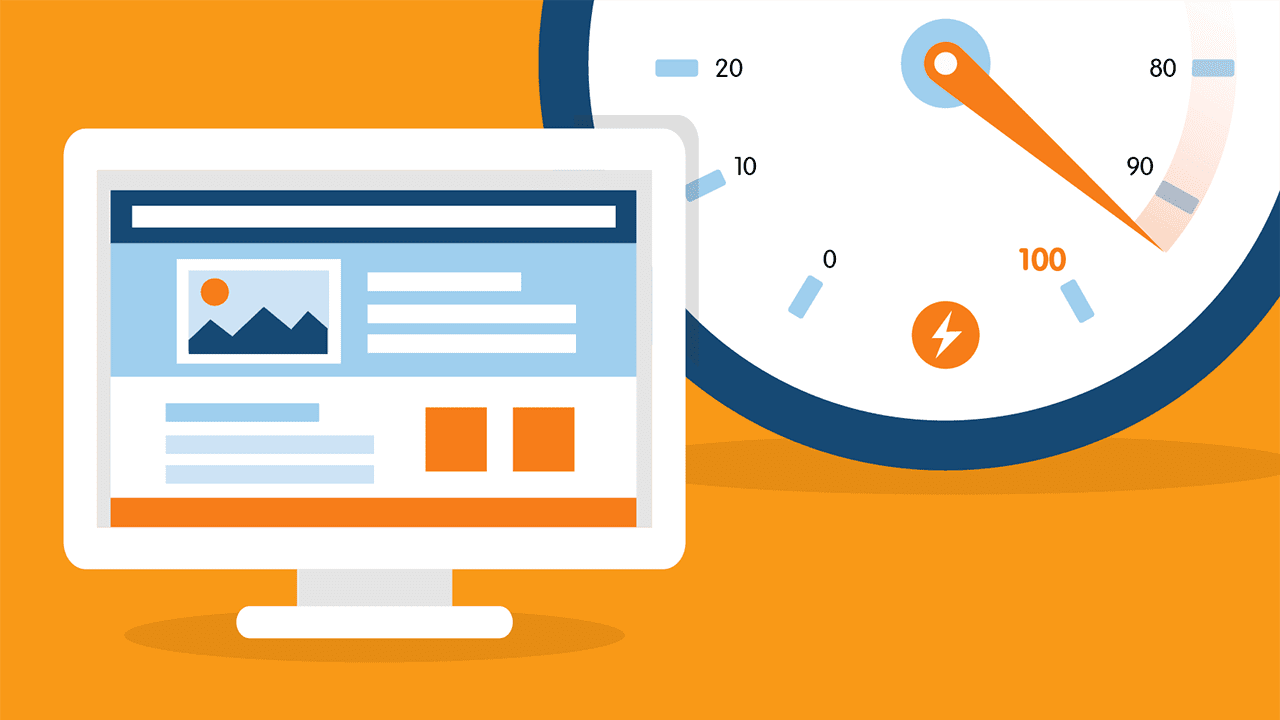
Your website may load more quickly if it uses a minimalist web design. Load times are heavily influenced by visual elements. The more visual elements a page has, the longer it will take to load. When a visitor loads a page, they must download all of the page’s visual elements. Minimalism ensures that your website’s pages are stripped away of unnecessary visual elements that would otherwise increase their load times.
Lower Bounce Rate
Because it offers faster load times, a minimalist web design can keep your website’s bounce rate under control. Bounce rate is a metric for the percentage of visitors who leave after accessing a single page. Some visitors may access a half-dozen pages before leaving. Others may access only a single page before leaving. Visitors who fall under the latter classification will contribute to a higher bounce rate.
You can optimize your website for a lower bounce rate by using a minimalist web design. According to Econsultancy, two in five visitors will leave a website if it takes longer than three seconds to load. With fewer visual elements, visitors won’t have to wait long for your website. They’ll be able to quickly load your website and the pages to which they navigate, thereby promoting a lower bounce rate.

Easier to Maintain
When compared to other, more complex types of web design, a minimalist web design is easier to maintain. It usually requires little or no upkeep, in fact. Even if you update your website’s content management system (CMS), as well as its server software, your site should continue to work flawlessly thanks to its minimalist web design.
A complex web design will make it difficult to maintain your website. You may perform a routine CMS or server update, only for it to break some of your website’s visual elements. You’ll then have to identify and fix the broken elements so that they render correctly. If you’re tired of chasing problems after routine updates, you should consider switching to a minimalist web design.
Better Cross-Device Compatibility
A minimalist web device can improve your website’s cross-device compatibility. Visitors today are no longer restricted to using a traditional desktop or laptop computer. There are other devices that can connect to the internet, including smartphones, tablets, smart wearables, infotainment systems and more.
Different devices, of course, use different technologies to load and display website content. Your website might be compatible with desktop and laptop computers. When a visitor attempts to access it on a smartphone, however, they may struggle to view and use it. Some of your website’s visual elements may load outside of the viewport, whereas others may load in a small size that makes them difficult to view on a mobile screen.
For better cross-device compatibility, look no further than a minimalist web design. It will increase the range of devices with which your website is compatible. Your website won’t have an excessive number of visual elements. With a minimalist web design, it will only have basic and essential visual elements. As a result, your website will be compatible with more devices.

Higher Search Rankings
Another potential benefit of using minimalist web design is higher search rankings. A minimalist website loads faster. Google, Bing and other search engines use a site’s load times as a ranking signal. Because a minimalist web design reduces your website’s average load times, it will be better aligned with search engine ranking algorithms.
A minimalist web design can help your website attract more backlinks. When visiting your website, other webmasters will be able to easily view your site’s content. They won’t be distracted by its visual elements. Instead, they can focus entirely on your website’s content, which may compel them to link to your site after leaving it. With more backlinks, your website’s rankings may improve.
Whether they operate their own websites or not, visitors will stay longer if your website uses minimalist principles. They’ll navigate to more pages, and they’ll spend time viewing the content on those pages. As your website’s average session duration increases, so will its ranking authority. Combined with faster load times and more backlinks, your website may then rank higher.
Whether you’re in the early stages of launching your website, or if you’re looking to give your established site an overdue makeover, you should consider using a minimalist web design. Aside from being easy to create and implement, it offers some noteworthy benefits. Using a minimalist web design can lead to fewer errors, faster load times, a lower bounce rate, less maintenance, better cross-device compatibility and improved SEO.


