Color Psychology Marketing and The Meaning of Colors in Marketing
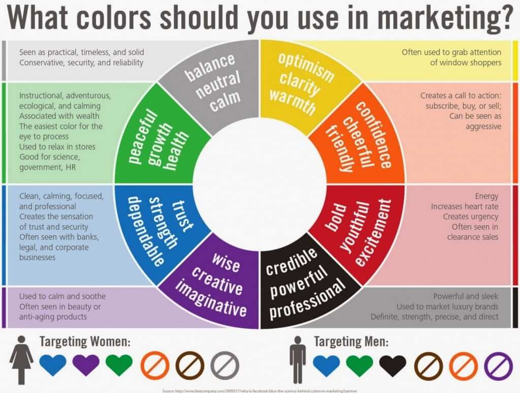
In marketing, the meaning of color and color psychology play an essential role in the art of persuasion with the goal of eliciting action from the consumer. Color is a strong non-verbal form of communication used by marketers to help evoke an emotion. Color psychology is the study of how colors affect human perceptions and behavior.
Have you ever heard someone say, “she looks at life through rose-colored glasses?” Have you thought about what that really means? The basic idea behind this common colloquialism is that colors have an effect on our psychology. As human beings, this concept has intrigued marketers and psychologists for decades.

The psychology of color in marketing is personal
Consumer responses to specific colors are not universal. The problem with much of the research available to marketers surrounding color theory is that it is often shallow. For example, a study might say that yellow makes people happy. The problem with this conclusion is that colors will have a different impact based on context, location, and even culture.
Western culture uses reds and yellows as caution or warning signs. However, the use of yellow in the context of sunshine or the McDonald’s yellow arches may also elicit feelings of joy.

Another example is the use of the color blue. In Western Culture, a blue sky can bring great joy, but blue can also be associated with sadness or melancholy, i.e. having “the blues.” In Eastern cultures, blue often holds significant religious value.
However, in Judaism, blue is the shade for holiness and divinity. In Hinduism, it’s the color of Krishna—the most highly worshipped Hindu god. With these nuances in mind, it’s important to think of color theory as a road-map, or a loose guide that should be used with respect for context and audience.

Gender can have an effect on color preference, but so can marketing
Color preferences not only differ between cultures but also across genders. The often-lamented concept that blue is for boys and pink is for girls is wholly the brainchild of marketers. It was completely reversed before the Second World War.
A June 1918 article from the trade publication Earnshaw’s Infants’ Department said, “The generally accepted rule is pink for the boys, and blue for the girls. The reason is that pink, being a more decided and stronger color, is more suitable for the boy, while blue, which is more delicate and dainty, is prettier for the girl.”
It wasn’t until the 70s and 80s that pink became synonymous with girls and blue with boys. This was also a result of marketers creating gender-based color schemes. Now, parents might have a baby girl and buy all the pink products in the world, only to have to start over with blue when they have a boy for their second child.
It truly is a piece of brilliant marketing. Gender stereotypes aside, research has found some utility in this phenomenon—men generally prefer bold colors while women tend to prefer softer colors.

Consumers make some purchasing decisions based on color alone
According to one study, “people make up their minds within 90 seconds of their initial interactions with either people or products. About 62‐90 percent of the assessment is based on colors alone.”
Hold on a second—90 percent is a BIG number. Wielding this information, choosing the right color for a product can give marketers an equally big advantage over the competition. This same research found that marketers can “use colors to increase or decrease appetite, enhance mood, and more.”

The meaning of color in design for brands
Although customers respond strongly to certain colors, choosing a color based on its corresponding “mood” or effect is not the end-all-be-all. Another study found that “an appropriately chosen color for a brand name (logo) can bring inherent and immediate value to a brand.” This means that the appropriateness of a color can determine consumer behavior. For example, a bottle of shampoo made specifically for blonde hair would probably not perform as well in a brown bottle as it would in a yellow or gold bottle. In this case, color can depict the functionality of a product, but in other cases, it can depict the personality.
Take a look at the GMC website for example. You’ll notice the bold and “masculine” colors used—red, black, and silver. These colors depict a rugged and independent brand, which accurately embodies the persona that GMC is going for. Now imagine the website cast in pastel colors, like lavender, baby blue, and mint. This color palette would likely be confusing to the consumer and would not serve GMC’s sales goals well.
The studies suggest that color appropriateness carries more weight than choosing a color based on its perceived psychological effects alone. Psychologist and Stanford professor Jennifer Aaker has conducted extensive studies on this concept. The study resulted in the development of 5 core dimensions of brand personality. These dimensions are a road-map for brands when choosing an appropriate color for their products, logos, marketing materials, and more.

Colors that stand out are the most memorable
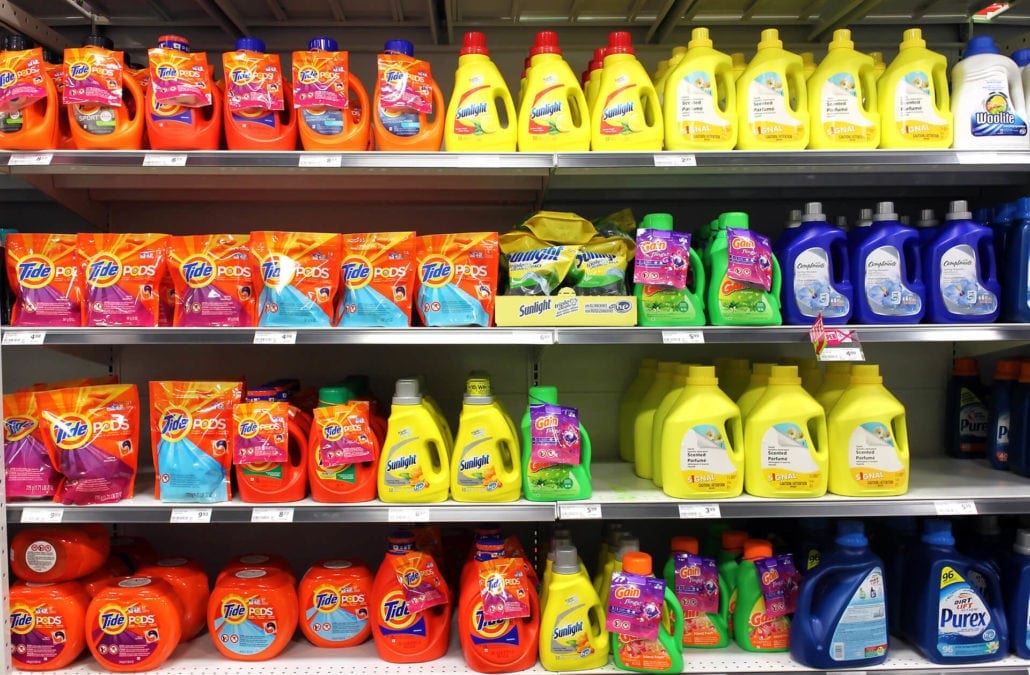
In addition to color appropriateness, the ways that we use colors together also has an effect on consumer psychology. A principle known as the Isolation Effect states that colors that stand out the most are more likely to be noticed and remembered.
Notice the picture below. Which apple would you recall most after you look away? Did you say the red one? Marketers can use this concept to draw the eye to their product in a display of competitors. A contrasting base and accent colors is an effective marketing tool.

The Isolation Effect is particularly important when considering user flow in website design. Its effects must not be confused with a user reacting to the qualities of one color standing alone. If a green CTA button gets more clicks than a blue one, it doesn’t mean that consumers are responding to the green alone.
When it’s revealed that the rest of the website is the same shade of blue as the blue button, it makes sense that the blue button is blending in and the green stands out.
Marketers can make better decisions using color theory
The bottom line is that there are no concrete guidelines to color theory in marketing. But, the research available does offer a great deal of insight into the effects that colors have on consumer decisions. By considering the Isolation Effect, color appropriateness, context, and product personality together, marketers can find better solutions to their challenges.


