
Color Psychology Marketing and The Meaning of Colors in Marketing
Choosing the right color can make or break a brand’s connection with its audience. Color psychology in marketing explores how hues influence emotions, perceptions, and buying decisions—unlocking a powerful tool often overlooked despite its critical role in shaping consumer behavior.
What Is Color Psychology in Marketing?
Color psychology studies how colors impact human emotions and behavior. In marketing, it translates into strategic color selection to influence brand perception, evoke specific feelings, and guide consumer responses. It’s the science and art behind why fast-food logos often use red or why financial brands prefer blue.
This field combines neuroscience, cultural anthropology, and design principles to create visual experiences that resonate subliminally yet powerfully with target audiences.
Why Color Matters in Marketing Strategy
Colors affect attention, memory, and decision-making. They can enhance brand recognition by up to 80%, making them indispensable for visual identity. Marketing messages paired with the “right” colors can increase conversion rates by stimulating desired emotional or psychological reactions.
Brands leverage color to:
- Communicate personality traits such as trustworthiness, excitement, or luxury
- Create mood and atmosphere that align with product or service benefits
- Signal offers or calls to action through color contrasts and highlights
- Differentiate products within competitive markets
Ignoring or misapplying color psychology risks sending mixed or negative signals, which can alienate customers.
How Humans Process Color: The Science Behind the Influence
Color perception begins with light wavelengths received by the retina and interpreted by the brain’s visual cortex. Yet the emotional impact engages deeper brain centers such as the limbic system, responsible for emotion and memory.
Research shows that:
- Red increases heart rate and stimulates excitement
- Blue induces calm, signaling stability and trust
- Yellow boosts optimism and attention
- Green symbolizes growth, health, and eco-consciousness
However, response to color varies by context, culture, and personal experience, requiring careful audience analysis during brand development.
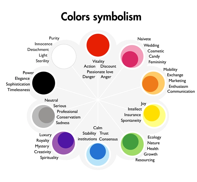
The Meaning and Marketing Impact of Core Colors
Businesses commonly use a palette of core colors that convey universal associations. Understanding these meanings provides a blueprint for visually aligning brand values and marketing objectives.
- Red: Energy, urgency, passion, appetite stimulation. Widely used in retail and food industries to encourage impulse buying and convey excitement.
- Blue: Trust, professionalism, serenity. Preferred by financial institutions, tech companies, and healthcare brands for credibility.
- Yellow: Optimism, creativity, attention. Effective for call-to-action buttons and brands targeting youthful or cheerful markets.
- Green: Nature, balance, health. Commonly associated with sustainability, organic products, and wellness.
- Orange: Enthusiasm, innovation, affordability. Captures playful yet confident brand voices.
- Purple: Luxury, wisdom, spirituality. Often found in cosmetic, entertainment, and premium service brands.
- Black: Sophistication, power, elegance. Popular in high-end products and fashion industries.
- White: Purity, simplicity, cleanliness. Utilized for minimalist design and brands promoting clarity or hygiene.
Strategic combinations can refine these messages but require harmony and user-centric testing.
Cultural Variations in Color Perception
Color meanings shift dramatically across global markets, so localization is crucial.
- White signifies purity in Western cultures but mourning in some Eastern traditions
- Red symbolizes good luck and prosperity in many Asian countries
- Green can represent both fertility and danger depending on regional beliefs
Ignoring these nuances can result in brand misinterpretation or offense. Multinational brands invest heavily in color research aligned with regional psychographics to avoid pitfalls and resonate authentically.
Applying Color Psychology to Brand Identity Design
Effective brand identity harnesses color to evoke emotional responses that match brand values and target customer profiles.
Key steps include:
- Defining brand personality to select colors that communicate tone (e.g., energetic, trustworthy, playful)
- Aligning color choices with customer demographics and psychographics
- Testing colors in real-world applications like logos, product packaging, and digital interfaces
- Ensuring accessibility through contrast and color-blind considerations
Case Study: A fintech startup increased user signups by 23% after revamping their color palette from vibrant orange to reliable blue, reflecting security and professionalism that appealed to risk-averse customers.

Color Psychology in Advertising and Conversion Optimization
Colors amplify advertising effectiveness by reinforcing message tone and stimulating action.
- Urgency: Red or orange invoke immediate attention important for limited-time offers
- Trust and reassurance: Blue and green lower purchase anxiety for high-value or complex products
- Clicks and CTAs: Bright contrasting colors increase button visibility and conversion
- Segmentation: Different color schemes tailored to audience personas can improve campaign relevance
Example: An e-commerce platform saw a 15% lift in checkout completion by optimizing “Buy Now” buttons using high-contrast red against a neutral background.
Common Color Psychology Marketing Mistakes to Avoid
Avoid oversimplifying color meanings or choosing colors solely based on personal preference or trends.
- Failing to account for target audience cultural context
- Ignoring accessibility guidelines that affect readability for color-blind users
- Overuse of bold colors that create cognitive fatigue or distrust
- Under-testing color combinations across platforms and devices
Consistent evaluation and user feedback help refine color strategy over time for maximum impact.
Industry-Specific Color Psychology Applications
Two verticals illustrate nuanced application of color psychology:
Healthcare: Trustworthiness and calm are paramount. Brands typically use blue or green to evoke serenity and natural healing, minimizing aggressive or overly vibrant colors that could heighten patient anxiety.
Luxury Fashion: Black, gold, and deep purples connote exclusivity, sophistication, and timelessness. Strategic splashes of bold colors in seasonal collections can energize while maintaining a premium identity.
Emerging Trends and AI-Driven Innovations in Color Usage
Artificial intelligence supports hyper-personalized color optimization by analyzing massive datasets on consumer reactions and engagement metrics in real time.
Innovations include:
- Dynamic color palettes that adapt to user preferences and environmental conditions
- Predictive analytics to forecast how color changes impact sales and brand perception
- VR/AR environments testing color immersion effects before launch
These tools offer marketers unprecedented precision in harnessing color’s psychological power.

Mini Framework: The “COLOR” Model for Strategic Color Decisions
A simple model for applying color psychology strategically in marketing:
- C – Customer: Understand your audience’s demographics and psychographics
- O – Objective: Define the emotional or behavioral goal (e.g., trust, urgency, luxury)
- L – Landscape: Analyze competitors’ colors to differentiate
- O – Optimization: A/B test color variations for conversion potential
- R – Review: Continuously monitor performance and adjust accordingly
Measuring the Impact of Color on Marketing ROI
While challenging, quantifying color’s influence is essential.
Key metrics include:
- Conversion rate differences pre- and post-color changes
- Engagement rates such as click-throughs on color-coded calls to action
- Brand recall and recognition benchmarks from consumer surveys
- Emotional response data via biometric or neuromarketing tools
Leveraging these insights informs smarter color strategies that align budgets with impact.
Incorporating Color Psychology Into Omnichannel Marketing
Consistency across platforms strengthens color-coded brand messaging. From packaging to website, social posts, and physical retail, a coherent color identity builds trust and recognition.
Challenges include color reproduction differences between digital and print media, requiring professional management of color profiles and standards.
Brands that master omnichannel color psychology enjoy amplified consumer loyalty and seamless brand experiences.
The Psychology of Color Contrast and Balance
Effective marketing design balances color contrast to create readability, hierarchy, and visual interest without overwhelming the viewer.
- High contrast enhances call-to-action visibility
- Harmonious palettes build brand cohesion and aesthetic appeal
- Over-saturation can fatigue or repel users
Understanding color theory fundamentals supports strategic creative decisions that maximize message clarity and emotional impact.
Tips for Testing and Validating Color Choices in Marketing
Pre-launch testing prevents costly missteps in color usage. Best practices include:
- Using multivariate testing tools to compare color variants simultaneously
- Collecting qualitative feedback through focus groups and interviews
- Leveraging heatmaps and eye-tracking to analyze attention focus
- Monitoring analytics for bounce rates and dwell time related to color changes
The Emotional Spectrum: Enhancing Storytelling Through Color
Color works as a silent narrator in brand storytelling, shaping audience emotions before a single word is read. Customized palettes guide perceptions of brand history, mission, and promise without verbal explanation.
For example, gradients blending blue and green might create an impression of sustainable innovation, while stark blacks and reds suggest bold authority.
Leveraging Color Psychology in Content Marketing
Beyond visuals, indicating value through color-coded sections or headers can improve readability and emotional engagement. Infographics, blogs, and videos using consistent color prompts help encode information and trigger retention.
Brands that innovate in this space improve user experience and deepen content impact.
The Metaphor of Color as the “Emotional Currency” of Marketing
Think of color as a form of emotional currency that marketers use to transact feelings and perceptions immediately and unconsciously. Like money exchanges value in commerce, color exchanges meaning in human minds. When properly invested—through strategic selection and layering—it yields rich returns in brand equity, loyalty, and conversion.
Misused, it can devalue the brand, sow confusion, or undermine trust, making color a critical asset in the marketer’s toolkit.
Mastering color psychology is both a science and an evolving art, demanding continuous learning and adaptation. As consumer expectations shift and technologies advance, color strategies must also evolve—harnessing data-driven insights and emerging tools to maintain relevance and emotional connection in a visually crowded marketplace.